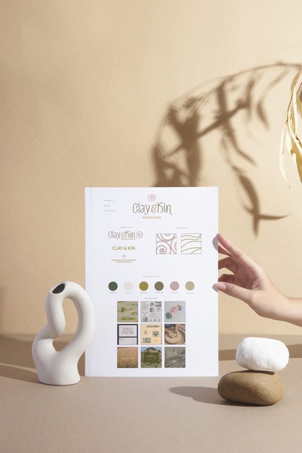
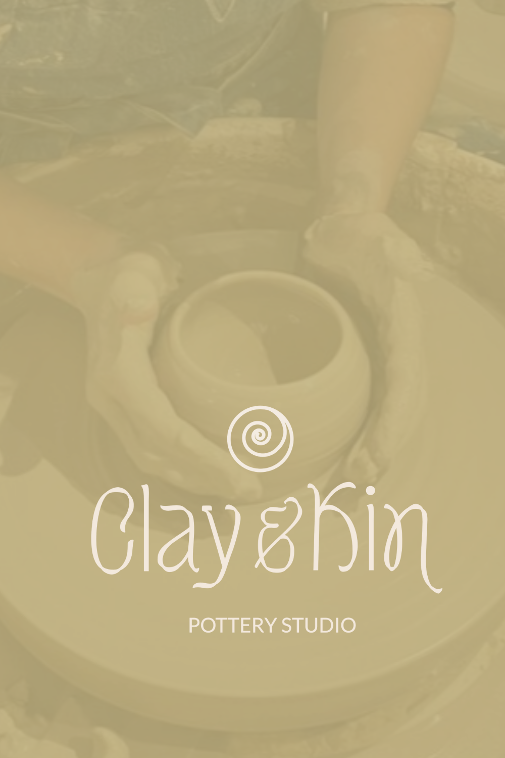
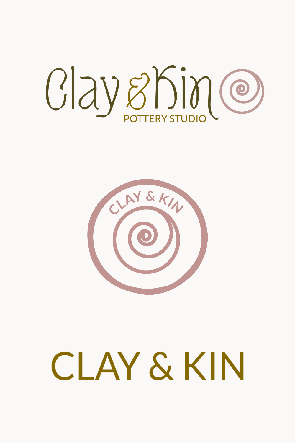
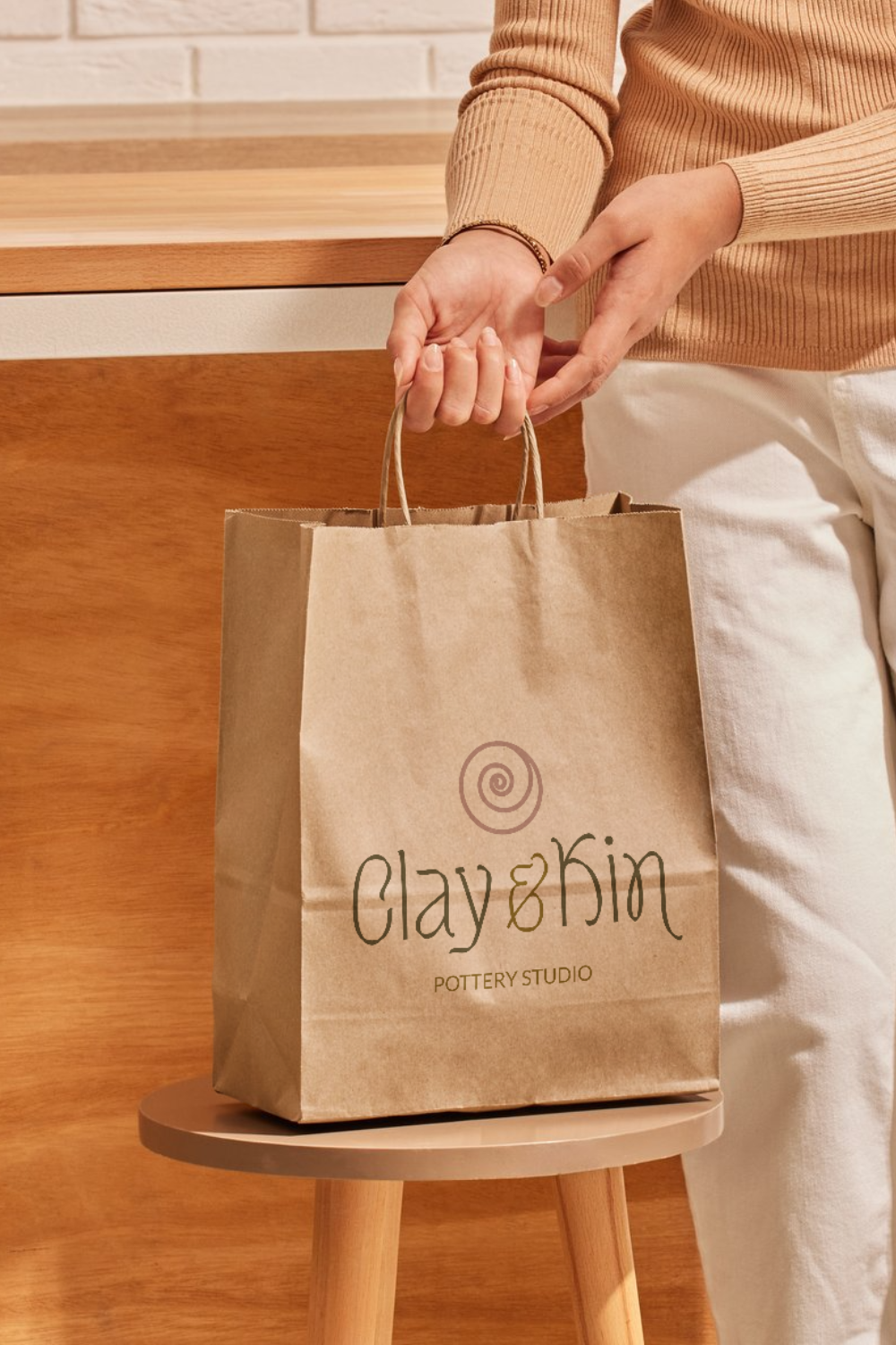
The Clay & Kin logo is more than a mark; it’s a visual reflection of the brand’s soul.
At its heart lies a spiral, a symbol that holds layered meaning. It represents the turning of the potter’s wheel, where form takes shape through rhythm, patience, and intention. It’s also a sacred spiral, echoing patterns found in shells, galaxies, and unfurling ferns—a reminder that creativity, like nature, is not linear. It grows outward in cycles: slow, steady, and expansive.
The spiral speaks to the journey of both the maker and the community: personal evolution, shared connection, and the ever-deepening relationship between hand, earth, and heart.
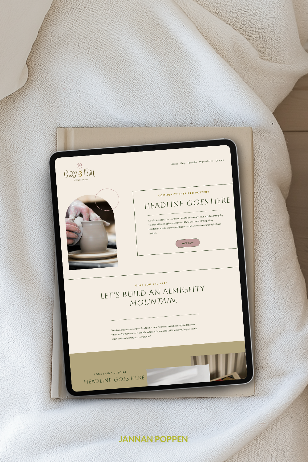
The typography is intentionally artful and warm. Organic curves and humanistic strokes mirror the hand-touched nature of ceramics. Elevated, but never sterile. It balances rustic beauty with quiet refinement, just like the pieces that line the studio’s shelves.
The color palette is rooted in the natural world, drawing from the hues of raw clay, soft stone, and weathered wood. These tones ground the brand in its physical space and materials, evoking calm, warmth, and a return to what is real and enduring.
Altogether, the logo is not just a design. It’s a tactile story. A symbol of transformation, kinship, and the deeply human act of making something from the earth, together.