Website Design Rules Everyone Should Know
So, you’ve got your website template and you’re ready to start designing….now what? Even with a template guide, creating an online space to be the perfect representation of you and your business is no small task. But the good news is, I’m here to be the support you need along the way.
Keep reading for my no fluff guide to the most important rules for website design.
When creating a website, design is everything. Your design encompasses the aesthetic and functionality of your platform, which will determine how you come across to the potential buyer. So with that in mind, here are my 4 design rules that everyone with a website should know:
1. Don’t let your viewer stay passive.
Your website is about YOU, so don’t be afraid to show your colors.
My number one rule of thumb until the end of time is Call. To. Action.
Anyone visiting your site should know exactly what you want them to do and exactly how to do it.
If your call to action isn’t clear, it’s not a call to action, it’s a call to confusion.
Ask yourself what the goal of your website is. Are you looking for clicks, sales, comments, messages? Decide what you want your viewer to do and then make it as easy as clicking a button. Keep your call to action the biggest, most noticeable thing on the screen. Make it simple for them, and the leads will flock to you.
2. Your website is about YOU, so don’t be afraid to show your colors.
There is no other brand exactly like yours, and your website should be as unique as you are. Whether your brand persona is funky and fun or calm and collected, your website should reflect that. So don’t be afraid to have fun when designing your website and to infuse that unique sparkle that only you have.
A website is so much more than a business portfolio, it’s an extension of your identity and your brand’s. Don’t be afraid to show your face and tell your story! A big part of running a successful business is selling yourself, and showing your authentic personality. The more you you are, the more you will attract the kind of clients you want to work with. This is your opportunity to shine, show your face in the way that you feel most confident about, and get personal with your audience. Remember, authenticity sells, so don’t be afraid to be as you as you can be.
3. A consistent aesthetic is key.
Good design does two things for you: it makes your site look beautiful, and it builds credibility.
When your website is beautiful, your brand looks good.
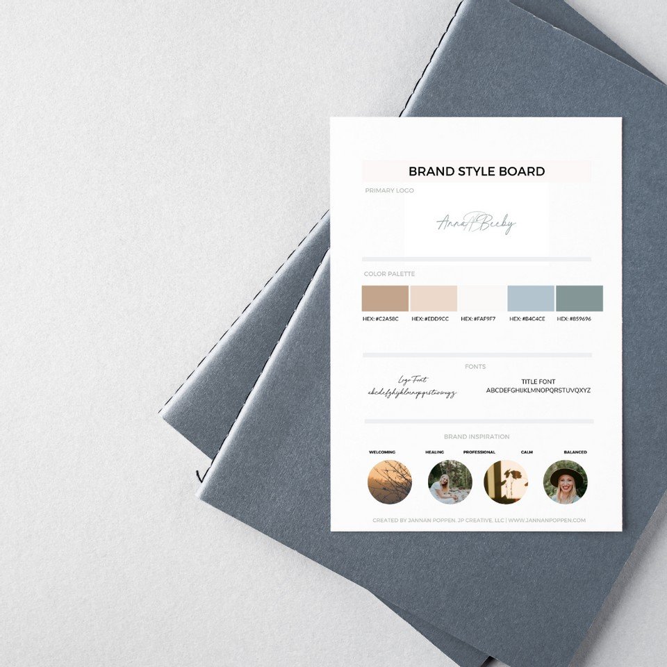
There are a lot of ways to make a beautiful brand, and I don’t want to stomp on anyone’s creativity, but there are a few basic rules of thumb that are good to know. Stick to a consistent color palette and consistent fonts. Minimal color palettes of 3-4 colors usually look best, with a good balance between neutral colors and bold ones. There should be no more than three different kinds of fonts on your site, and you’ll want to make sure they are legible above all else. Clear, clean, simple fonts that are easy to read will ensure that your clients receive the invaluable message that they need to hear from you!
4. Less is more.
You don’t have to be a minimalist when it comes to your home decor, but you do when it comes to your website.
A cluttered user experience is the quickest way to turn potential clients off and confuse them.
Keep your website clear, simple and easy to understand (see tip #1 again if you need a reminder.) If possible, avoid having ads or anything else cluttering up the sidebars on your site. Your core message should be crystal clear and shine through everything else.
I hope you found these tips helpful as you embark on your journey to creating a high converting online space for your business to thrive. Need more help with the process of customizing your pre-made Squarespace template?
Click here for my tutorials on how to turn your template into a custom site that reflects your brand flawlessly.
Til next time,
Jannan


